

A quick recap on our previous blog about color: we covered giving your bathroom a personality, choosing colors that compliment your skin’s undertones, the importance of contrast (especially in a white, neutral bathroom), and ways to take advantage of small bathrooms. Let’s continue the conversation by talking about materials!
CHAPTER 2 - MATERIALS
Contrast
Jumping back into the topic of white bathrooms, let’s talk about what not to do. All white floors, walls, tiles, tub, sink, etc. are not the look and frankly never was. Don’t take this personally, we’ve all done it one time or another.
White is a great, clean look, but only when you allow it to pop with some contrast. We’re not talking about “contrasting” with other off-white neutrals. If you want a bohemian, neutral look; try using natural materials and textures to balance the space. Whatever your end goal is and the personality you have dedicated to your bathroom, pair contrasting colors, contrasting materials, contrasting patterns – white vs. a deep hue of blue, wood vs. a busy tile, chevron vs. ship-lap – whatever it may be! This goes back to giving your bathroom a personality, giving it depth and substance. Minimalism is trendy, bland is not.
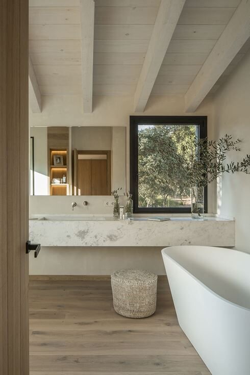
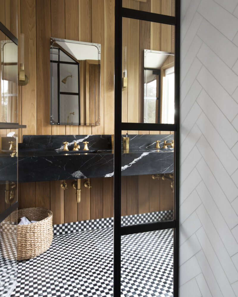
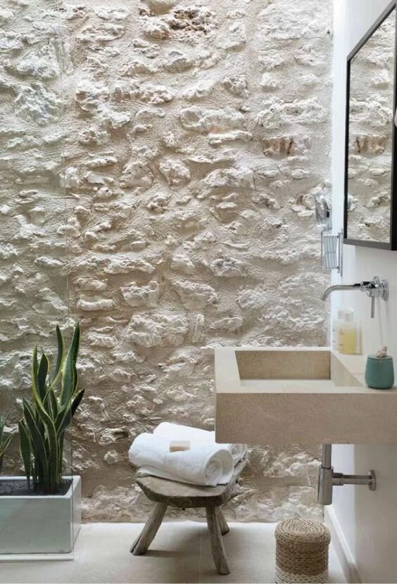
Left Image: Image By Susanna Cots Interior Design | Design: @susannacots Middle Image: Image by Sketch Forty Two | Design and photo: @sketchfortytwo | Construction: @monmouthcustombuilders Right Image: Image by Bloom Int Design | Design: @bloomintdesign | Photo: @stellarotger | Styling: @gemaberenguer | Location: @calreiet
More On That…
Image by Sarah Sherman Samuel
Design: @sarahshermansamuel | Photo: @jasonfrankrothenberg for @dominomag
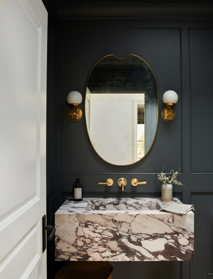
We’ve talked extensively about color and broadly on material contrast, but there’s a whole other world of how to incorporate visual contrast.
Designing a bathroom is not just picking out different color schemes from the same puzzle. It doesn’t have to follow any sort of set design. Let’s say you want your bathroom to be a place of Zen and tranquility - why not offset a mirror? No one is forcing you to place it directly above the sink. You’re not piecing together some standardized puzzle, you’re painting a picture, telling a story. The story here could be: you have the option to look in the mirror, but it does not have to play a part in this experience, in your mood, in the intentions you set. Instead, place a window above the sink and create a vanity space beside it. Do you want your guests to be swept away with how good they look, or how beautiful the view is? Neither is wrong, but neither is the only choice!
Another way to create contrast is to play with consistent or complementary shapes and lines. Keeping a consistent geometric or organic rhythm will “wow” your guests, without them even knowing exactly what it is about your bathroom that just makes them feel balanced.
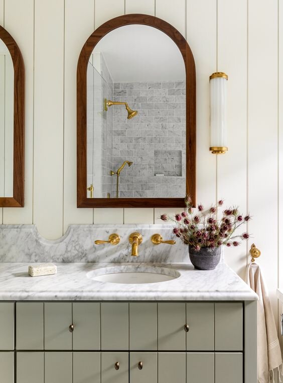
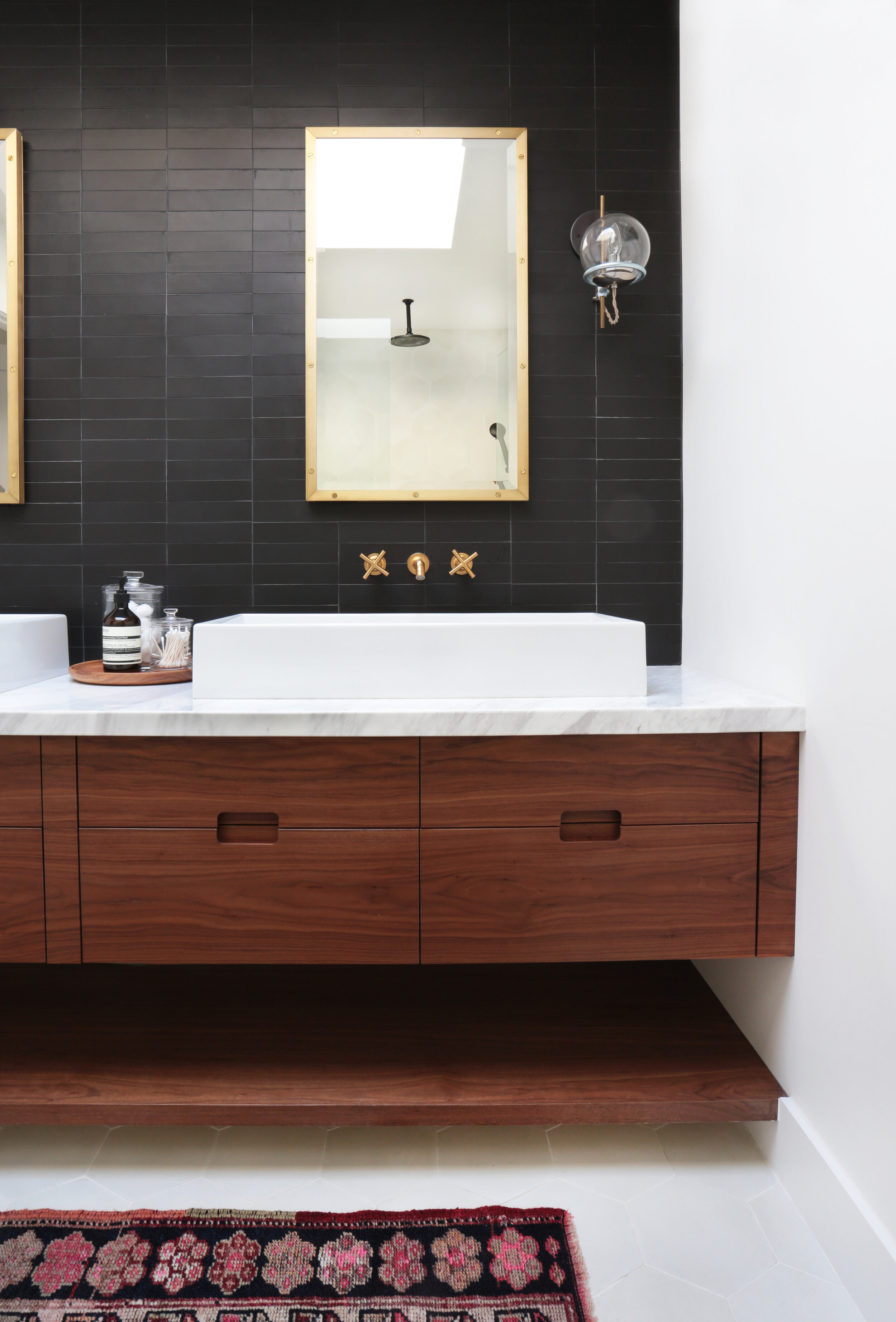
Image by Heidi Caillier Design
Design: @heidicaillierdesign | Photo: @haris.kenjar
Like in the photo above, you can do this by pairing a round mirror with round lights, cabinet knobs, a round element in the plumbing fixture, or the decorations you use. Then complimenting this shape with simple rectangle blocks seen in the wall tile, countertop, cabinetry, and a couple of floating shelves. This is just ONE example. The point of doing this is not to be obvious and flashy, but to allow your guests to feel balanced between all the layers of symmetry.
Would you have seen that in the photo without us pointing it out for you? Try it yourself! Go ahead and make a couple of notes of the shapes and lines this next photo is playing with!
If You’ve Got It, Flaunt It.
If you are at all familiar with the movie, How To Lose A Guy In Ten Days, you may be familiar with “frosting yourself”. This was the marketing slogan that Matthew McConaughey’s character used to mean: deck yourself out with jewelry. My lesson here is to let your hardware be your jewelry, or “frosting”. Don’t be afraid of those statement metals – satin gold, antique brass, brushed bronze, etc. – if anything, adore them! This is where you can make a real statement, especially if you’re designing a simple white or black bathroom, or if you’re playing with color! Carry the metal throughout the plumbing fixtures, cabinet and bath hardware, mirror frames – wherever you see fit.
Left Image: Image By Amber Interiors | Design By @amberinteriors | Photo By @tessaneustadt Right Image: Image By Amber Interiors | Design By @amberinteriors | Photo By @tessaneustadt
Where You Can & Can’t Pinch Your Pennies
(Really more of “Can, Should Not, & Depends” list, but that didn’t stick…)
Can: Tiles.
We do not condone buying the cheapest tile you can find, just because you can. If you’re willing to invest, do it. However, if you need to cut off some costs, this is a great place to consider. There are plenty of simple, sleek tile options at Lowes or your local tile store, but if you are feeling especially creative, find a small space to implement tile – whether that be above the vanity or within a shower niche – and showcase some intricate, quality options. Tile is a great way to exude the personality of your bathroom.
Can’t: Paint.
While paint shouldn’t cost an arm and a leg, it’s not worth buying the cheapest one out there because it’s “just paint”. Especially if your bathroom includes a shower, the paint you choose should be for bathrooms and should be water-resistant. Do your research – will it show streaks? Is it hard to clean? Cheap paint will make your bathroom look exactly that: cheap.
Can’t: Plumbing fixtures.
Buying quality plumbing fixtures will save you time and money in the long run. You’ve got 99 problems and plumbing doesn’t have to be one. Simple enough.
Depends: Countertops.
Let’s be clear: buying cheap countertops is not in your best interest. For one, you don’t always need a countertop. Maybe just try a floating sink! Or if you want a full vanity and don’t want to break the bank with a Marble countertop, try Quartz, Slate, Soapstone, or just visit your local countertop showroom! You don’t have to be an expert, even we don’t have to be an expert because there are already experts out there. Just don’t get suckered into a high-maintenance, high-priced Marble or Granite top if it doesn’t fit the bill. The type of bathroom you are shopping for is widely important when deciding on the type and durability of countertops.
Depends: Lighting fixtures.
If you are considering lighting for a Powder Room, this is where you can get away with a less expensive option. We are careful to use the word “cheap”, because often: cheap looks cheap. If you are selecting lighting for a full bathroom, this is where you need to invest in a good metal for those fixtures, otherwise, you will be facing corrosion due to condensation. Good lighting will elevate your space – don’t let it cheapen it. Other times, lights can be inexpensive to purchase but cost an arm and a leg to install. Read the reviews, read the installation guides and specification sheets if you need to, and absolutely keep the boxes and receipts until the lights are installed and working!
Have no fear! Pinterest is here!
We’ve touched a lot on using materials to create contrast in your bathroom design but take note: this contrast is to bring balance, not to scream at you. If you are struggling to understand or just don’t know how to implement this to your own design, Pinterest is a great resource. Pick out a couple of photos of a bathroom you admire, and note where you see contrast, personality, balance, and whatever else you want to include in your design. The point is not to copy what you see, but to observe the story being told through effective design. You got this. Check out our Pinterest board with more photos and ideas in the meantime. Until we finish this series with some tips on Function…