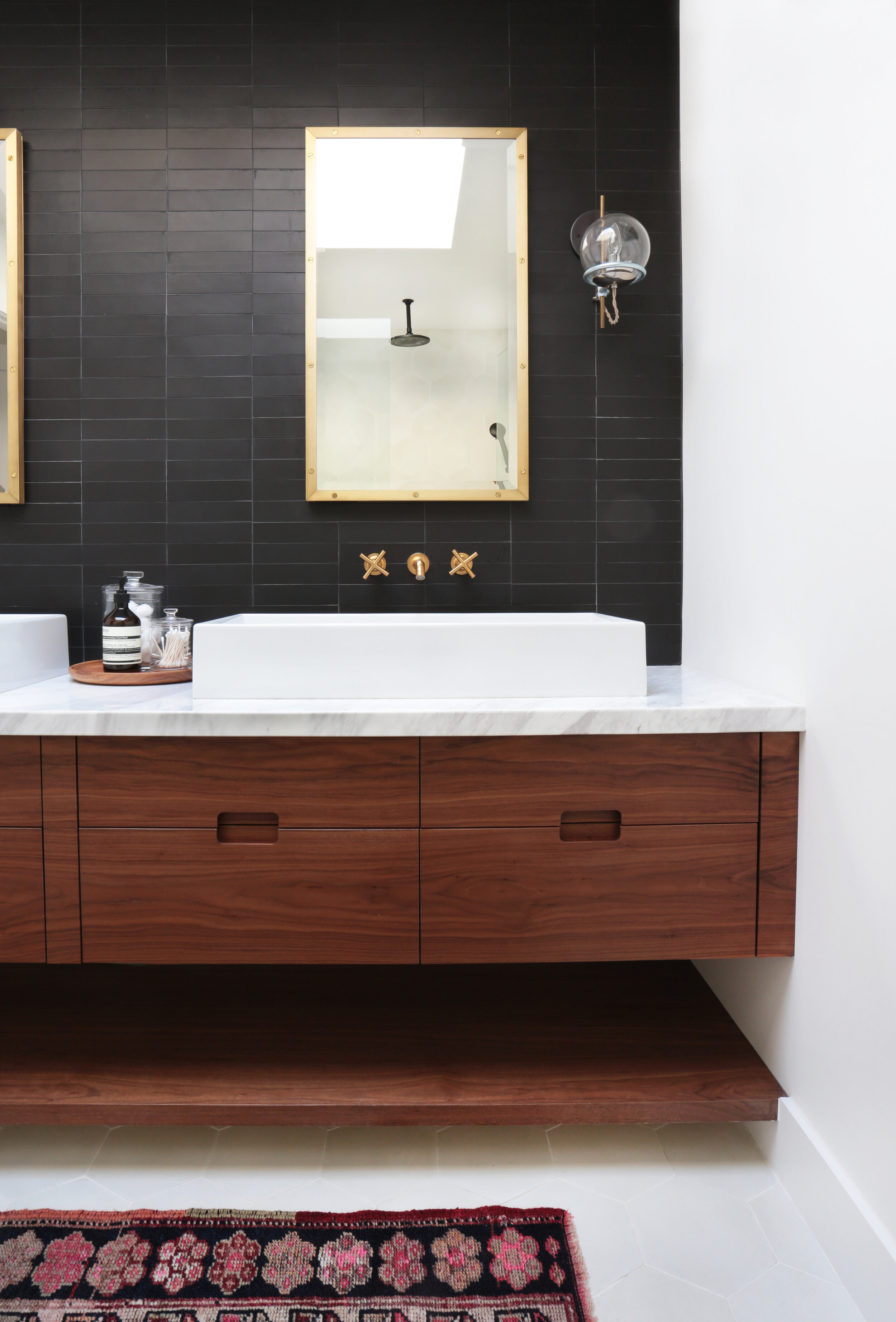
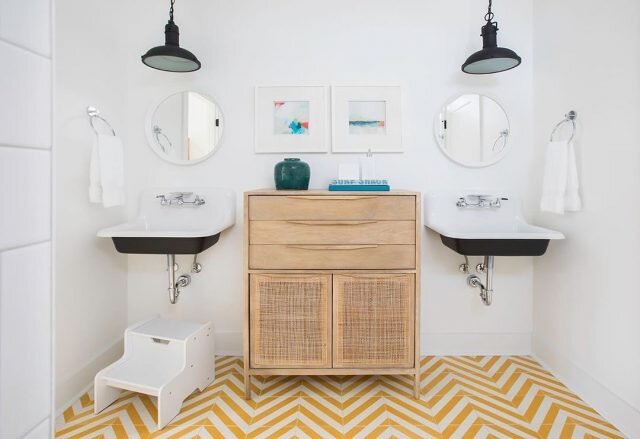
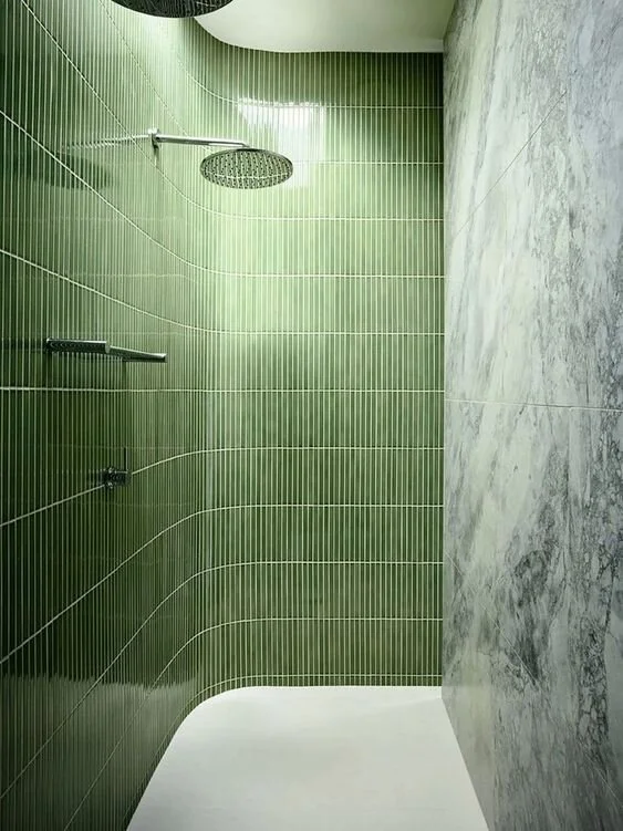
How To Stay On Top of Making Selections

Comment

How To Stay On Top of Making Selections

Read Time ~5 minutes

Thought your habit of procrastinating ended in school? We’re here to break the news that you will be tempted to jump back into those habits during the selections process. But we’re here to deliver the good news: we anticipated this and have created some tips and guides that won’t leave you screaming or tearing your hair out. At Mark Scott Homes, we strive not only to build your dream home at the highest quality, but the give you the best home-building experience.

The selections process may sound exciting for some and weary to others. Whichever side you’re on, it may feel redundant and even overwhelming at times. To break through habits of procrastination and avoidance techniques, we have 4 tips to stay on track during the Selections Process.

HERE’S HOW TO STAY ON TOP OF MAKING SELECTIONS:

1.     Organize the Details

  • It’s important to know what selections you need to make. Jot those down in an organized fashion. To help ease the process, we already have a head-start with our universal selections guide, which outlines what selections are needed and when they need to be made. In addition, we’ll provide you with a breakdown listing each specific item and its allotted budget.

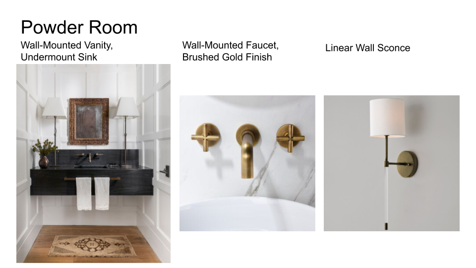
  • A great way to plan ahead is to create inspiration boards for each room. Pinterest is your best bet to find images for this. Isolate what you like about the photos you’ve chosen and try to find examples of such things as tile selections and patterns, hardware finishes, lighting options, all the way down to installation types for your basins and hardware – if you have it in you. The more prepared you are, the less overwhelming you will be when the showroom guide asks you what you would like to see. Because let’s face it, the options are seemingly endless but your time and money are not (& that’s okay!)
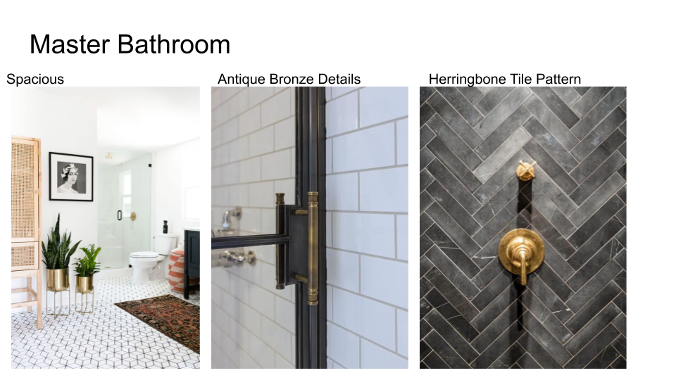
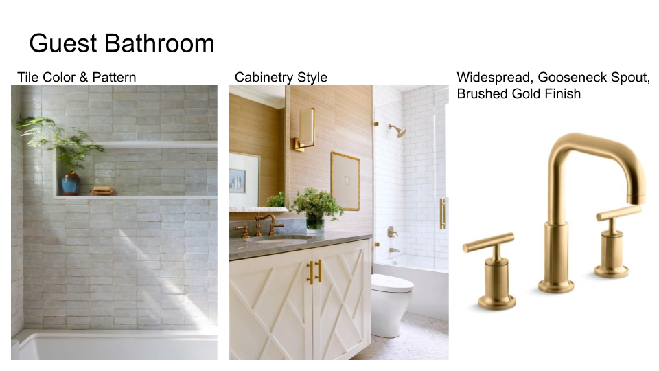


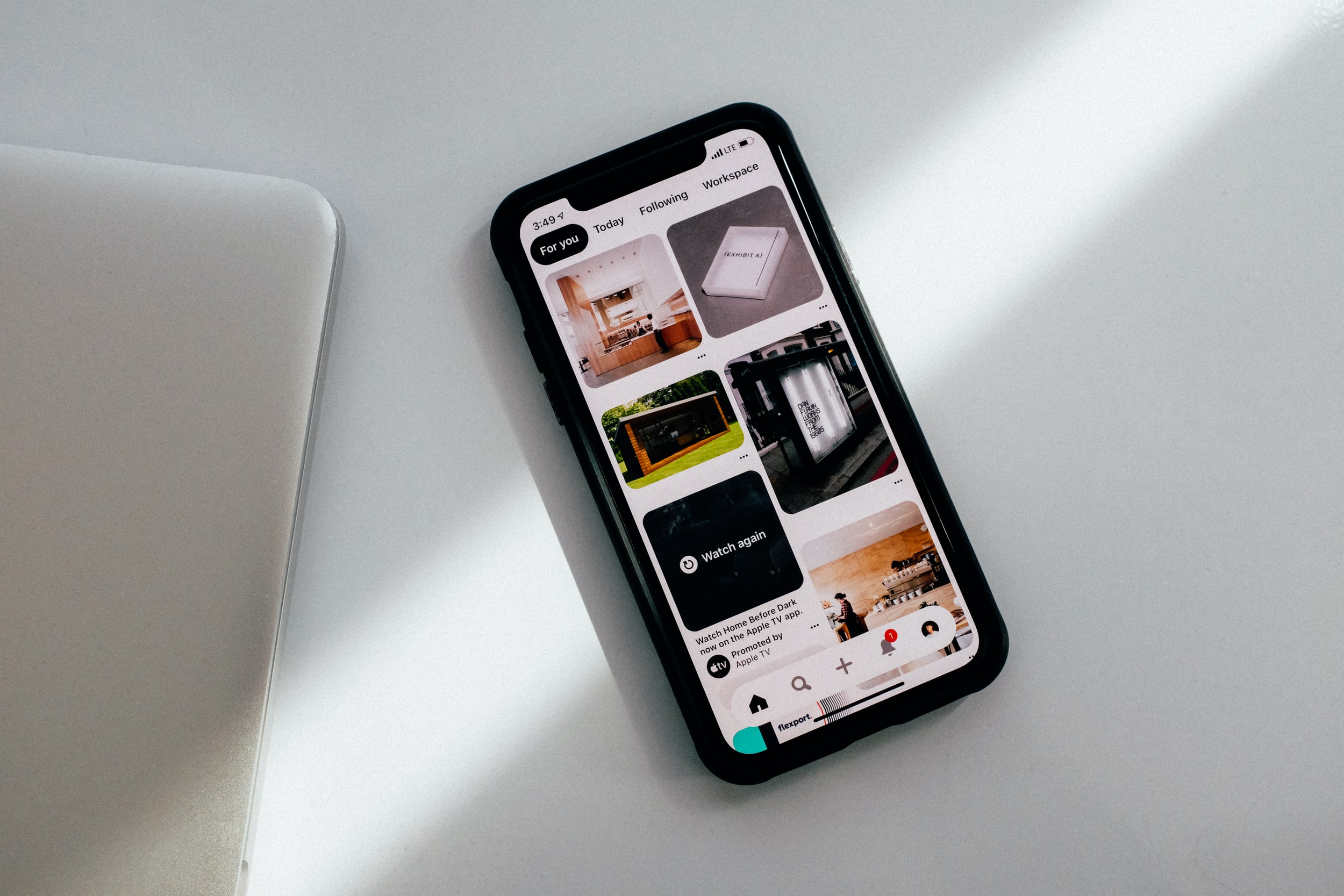
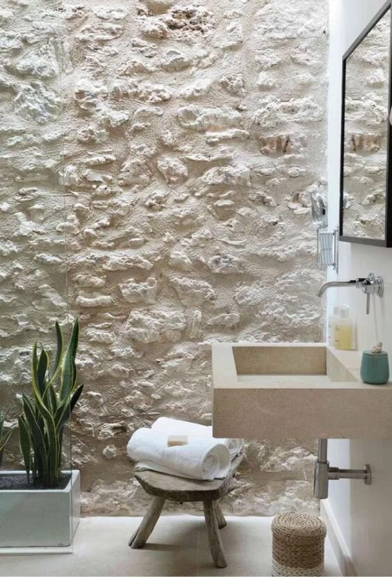
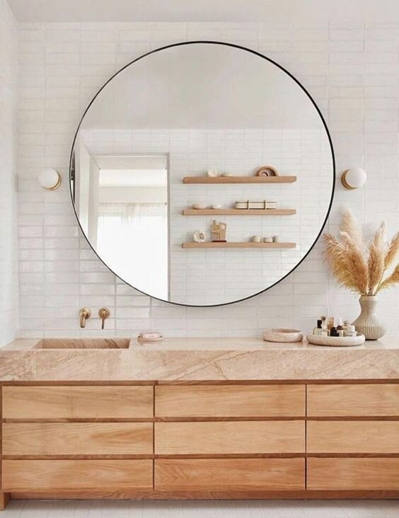
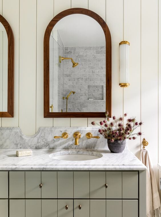
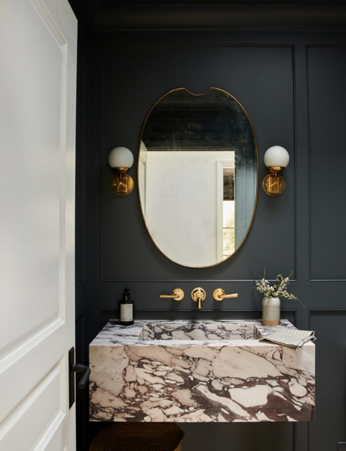
Examples of an Inspiration Boards from Pinterest photos. Click here for our blog on how to design your home using Pinterest.

  • If you go into any of these stores or showrooms thinking you only need to pick out hardware; you may want to pack a lunch. Like you did in school, your best work always had a rough draft. The same applies here. Make your inspiration board your rough draft.

2. Block Out Time

  • We know you’re busy. We also know you probably wouldn’t choose to knock out the decisions for your interior doors and plumbing fixtures on your day off. However, the more efficient and timely you are, the more efficient and timely we are. Our goal is to get you inside your home as soon as well can, but a lot of that depends on the efficiency of your decisions.

  • Allow yourself time to think over your choices before making the final decision. Our recommendation is to take those samples back home with you (where possible) and sleep on them for 24-48 hours before firming up your decision. We understand that not everyone is a calm and quick decision-maker, and we know the choices are seemingly unlimited. Give yourself grace, but also a deadline!

  • You may think you’ll be able to knock out all your selections in one day, but we advise you to block out 2 hours at a time to combat mental fog and exhaustion.

3. Ask For Help!

  • It’s okay you don’t know every type of architectural or cabinet door style. That’s what we are here for. We’re here to help and so are the showroom associates. We will do our best to educate you before we set you loose into the wild.

  • Keep in mind, any question you have has already been asked. We are committed to being your partner and advocate throughout this process.

4. Hire Someone To Do It For You!

  • You will still need to be a part of this process, but the work of sourcing and gathering are off your hands! We are happy to work with your interior designer if you decide to go this route.

  • Interior Designers are not just decorators. Qualified interior designers work with the contractors to deliver a home that fits both your functional needs and your aesthetic dreams. 

We are continually working on bettering our systems in place and coming up with ways to better educate you during this process. Mark Scott Homes is on your team and we are thrilled to have you on ours!

Comment

Paint Color Trends of 2021

2 Comments

Paint Color Trends of 2021

read time ~ 4 minutes

Thanks to 2020, our homes wear many hats.

What was once a place of relaxation is now the hub for all things living. Home is now our gym, our classroom, our office, our favorite restaurant, our kids' playground and our weekend getaway.

The chaos of 2020 and this change in the definition of "home" as we know it prompted the color trends of 2021. These trends feature creating a home environment where we can feel comfortable, soothed and at ease. 

Overall, we see a lot of warm, nature-infused tones to invite calm into our space and create a steady base from where we can add bursts of color to inspire joy and optimism in our lives.

Comfort. Calm. Creativity. Joy. Doesn't that pretty much sum up what we're craving in 2021? 

We think so. 

Let's step into the anticipation of 2021 and experience these color trends of the year ahead that could inspire new designs in your own home.

New year, new bedroom paint. Isn't that what the kids say these days?


BENJAMIN MOORE

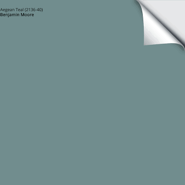
The Benjamin Moore Color of the Year 2021, Aegean Teal, is a hue that beckons you to savor the small moments. 

Here's how they describe it: "Celebrate the simple pleasures -- think the faded rumple of linen sheets in the morning and perfectly ripened fruits on the windowsill. The twelve hues in the palette radiate warmth and wellbeing. These are colors that make your home feel even more like home. Settle in."

Well, if that doesn't make you want to sip your coffee slowly at your kitchen table with a warm pastry to keep you company while your walls set the mood for you, we don't know what will.

Benjamin Moore's 2021 color palette invites presence. Its blend from familiar neutrals to earthy tones stall and expand the seemingly mundane, yet sacred moments that make up our lives.

For a strong sense of serenity and comfort, pair Aegean Teal with any of these hues to elevate your home.

Love it so much you just want your home transformed already?! C.E. Lee Decorating Center is your new go-to consultant when it comes to design. They have the Benjamin Moore products you need to make this 2021 color palette come to life in your space!


SHERWIN WILLIAMS

Sherwin Williams chose a sophisticated Urbane Bronze as their color of the year 2021. 

“The pandemic has caused us to seek comfort in our surroundings and be mindful of how we’re living,” says Sue Wadden, director of color marketing. “As a result, the focus in design and color has shifted to building relaxing sanctuaries within our existing spaces and interior paint colors can help accomplish this feeling. Urbane Bronze creates a sense of calm while making us feel safe and secure.”

Royal in nature, this color is noted by Wadden to work especially well in kitchen spaces. Got darker cabinet colors? Or metallic shades dispersed throughout your kitchen? Urbane Bronze is the perfect color partner to sophisticate your space.

But hey, maybe you already love your kitchen color. After all, you painted it the color of the year 2020 for heaven's sake!

We get it. Urbane Bronze is gorgeous not only in the kitchen, but also a great choice for an accent wall, an outdoor shed (which Wadden did herself) or any space where you want to highlight an architectural design, like behind your fireplace. 

Balance and rhythm. Balance and rhythm in design, in our routine and in our lives is the core message Sherwin Williams wants to send with their choice for the color of the year 2021. 

To shop Urbane Bronze and more, visit Sherwin Williams in South Bend, Granger or Niles!


BEHR

Behr's color trends of 2021 highlight warmth and restoration. In their palette of 21 hues, we see a lot of subtle, neutral tones and "restorative blues and greens" to "elevate comfort" in our homes, as well as bold, rich hues that inspire optimism. 

Versatility ties these hues together. We're in a global moment where our homes are being just about everything we need them to be for us. With an emphasis on versatility and personalization, Behr's palette gives the freedom to update any space exactly how we want it and need it.

When uncertainty erupts, we crave familiarity and comfort. These hues give us that, and more. If it's not a wall to paint, these colors work well for doors, trim and cabinets. 


PPG PAINTS

PPG Paint's color trends of the year 2021 orbit around a central theme: transcend

In their words, these colors are "intended for the person who wants to fully embrace mindfulness and intention" as "the color trio celebrates beauty of all kinds and relates to those who prioritize wellness in mind, body and spirit."

Their versatility allows for each of them to either take on a supporting or dominant role in a space. These natural hues are grounding, nostalgic and fresh, offering relief and support to the tired working man or woman, mom or dad, or anyone who needs a space to unwind.


DULUX

Brave Ground is Dulux's choice for color of the year 2021. This shade "connects back to nature and the simple things. A warm, earthy tone, it creates a feeling of stability, growth and potential."

It's timeless. Subtle. Relaxing. 

Brave Ground is complimentary and practical, and pairs especially well with warmer tones to bring a balanced energy to any space. Designed for the person who wants a solid, foundational color in their home as 2020 has forced us to muster up the courage to embrace change, to reassess what really matters and to work together to build a better future.


Regardless of the visual variety we see in the paint color trends of 2021, the intention behind them remains consistent: that in 2021, we'll seek to design our homes with colors that give us comfort and calm, inspire creativity and cultivate joy.

What do you think of the color trends of 2021? Like what you see? We think they set a great foundation for design in the new year with the balance of warmth and optimism. 2021 - we're ready for you!

2 Comments

How To Use Pinterest To Design Your Home

Comment

How To Use Pinterest To Design Your Home

Read time ~ 5 minutes

Pinterest has changed the way we create. From planning mom’s 60th birthday party to announcing an engagement to designing your bathroom to making brunch to DIYing lipstick, inspiration is everywhere on this handy platform.

So, thank you, Pinterest. Now we can never show up to another family BBQ without giving the dessert table a once-over and checking to see if the chip dip matches the ceiling fan.

Jokes aside, Pinterest is an incredible tool for all things creative, especially when it comes to designing your home. If you are building, renovating, or designing your home but don’t have a Pinterest account it’s time to make one.

Since its launch in 2010, Pinterest has made some major improvements, making it even easier to streamline your process for gathering inspiration and storing your ideas for the home of your dreams all in one place.

We’re giving you four tips on the best ways to do it.

Here’s how to use Pinterest to design your home:

1. Create and Organize Your Boards

Depending on if you’re renovating your entire home or a single room, be specific when you create your boards to organize your pins. Avoid creating a board titled, “Dream Home”, but break it down further and create boards for each room so you can easily find what you’re looking for. Are you renovating your master bath? Re-designing your closet? Building a front porch? Create boards for each project.

Pinterest is all about giving you the freshest, most relevant content. As you create each board, set a goal for when you want to finish say, designing your mudroom to get reminders about planning and keep your recommended pins relevant.

Want your partner, teen, or bff to give you their two cents? “Group boards” are a great option if you want collaboration on your pins to get everyone’s ideas in one place.

Don’t want your neighbors stealing your design ideas? We get it. You can also create “Secret Boards” so you can keep your brilliance to yourself.

Organize your boards on your profile either from A-Z, last saved to or drag and drop them in an order that makes the most sense to you.

Inside your boards, you can organize your pins any way you want. Maybe you want to move the pins you love the most towards the top for easy access, to put all the dining room tables you love next to each other to compare them side by side, or push your partner’s suggestion down towards the bottom.

The better you can organize your pins and boards as you go, the easier it will be to finish your project!

2. Find Your Favorite Pinners

Don’t follow hundreds and hundreds of pinners. Find the brands and bloggers who are active on Pinterest and creating quality content on the regular that aligns with your style. These will become the brands you trust and love (if they aren’t already).

Here are a few of our favorites:

  • Luxe Interiors + Design Magazine

  • Jean Stoffer Design

  • Studio McGee

  • Becki Owens

If you don’t follow hundreds and hundreds of accounts, your “following feed” will be more streamlined and less cluttered.

If following only a few pinners makes you panic, don’t worry. Pinterest saw that coming. On your “Home” and “Today” tab, you’ll get served the latest, most relevant content that matches the content of your most recent searches that aren’t limited to the accounts you follow.

3. Be specific with Your Searches

The more specific you can get with your searches, the better the content you’ll get. For example, if you search “mid-century modern brass lamp” you’ll get pages of great options and likely find what you’re looking for faster than if you had searched “cool brass lamp”.

Once you type in your super specific search, you can use the “Explore” tab or the “Shop” tab. With the “Shop” tab, you can see hundreds of mid-century modern brass lamps with their brand and prices and if you so desire, you can buy it right then and there. There’s always the option to use “More Ideas” for similar pins, or to “Shop Similar” whenever you search. Pinterest is making this too easy for us!

If you’re not ready to buy just yet but definitely want to save the idea, when you save each pin, make sure to comment what you love or don’t love about the pin to remind yourself of the specifics when you revisit it later. For example, “love the color, not the shape”. This is a great way to customize your pins!

Pinterest also lets you share or download your pins. Share your pins with your friends who are fellow pinners on the app by messaging it to them or sending them the link. Download the image if you want it saved to your phone or computer. These features make it easy to interact with your friends on or off the app and save the images to a folder on your computer if you want to store your ideas there, too.

4. Share it with Your Contractor or Designer

Keep your boards to yourself, or better yet, share them with your contractor or designer so they can get a better feel for your style.

This is where all the hard work you put into organizing your boards and pins pays off! Easily show your contractor or designer your dream for your living room, backyard patio or kitchen. Let them know exactly what you want.

Refer to any comments you made previously on your pins to point out the specifics. Maybe you loved the countertops, but you hated the backsplash. Or you loved the layout of the living room, but would love it even more if there were bigger windows. Point out what you like or don’t like about the design and let them browse your boards so they can make your dream home a reality.

Designing your home just got easier with Pinterest. Use these four tips next time you curl up on your couch with a glass of wine and get to work designing your home with this app.

Did we mention we’re big Pinterest fans, too? Follow us @markscotthomes to see our latest projects and get inspired for your own!

Comment

5 Things to Look for in a Custom Home Builder

1 Comment

5 Things to Look for in a Custom Home Builder

Read time ~5 minutes


Building a custom home has always been a dream of yours. Maybe you’ve already started your research and sketched out some plans, maybe it’s still a “one day” dream or maybe you’ve already bought the champagne for your first dinner party.

Wherever you’re at in the process, you deserve the best experience.

But before you pop the bubbly, you need to find a custom home builder to make your dream a reality. To choose the right builder for you, you need to know what to look for. But where do you start?

Don’t worry, we’ve got you covered.

Before you begin your search, know what you need.

Just like you wouldn’t buy a house sight unseen, you wouldn’t look for a custom home builder without first knowing what you need.

Once you know what your budget is, have a general sense of of the home you want, your non-negotiables, what’s important to you and what you want your experience to look like, it will be easier to find a custom home builder who fits your needs expectations, and understands your vision.

There are a lot of great qualities to look for in your builder. We came up with 5 to get you started with your search:

1. First, they listen.

Starting the process of building your custom home can be overwhelming, which is why it’s necessary to have a builder who listens to what you need and what you’re looking for before jumping in with the solution.

Great builders will evaluate your needs, your budget, and your values and align their solution with your best interest in mind.

After they listen long and hard, they might lay out what the most expensive elements of the design would be, what would be tricky to do and give you a rough figure of what the build would cost.

2. They pay close attention to detail.

There are a million details that go into building a custom home.

You need a builder with a well-established process who will walk you through these details and give you the confidence that your home will be built with taste and quality. Luxurious details that are carried out with intention will bring out your home’s unique charm and elegance.

You want a builder who will handle every detail of your home like it’s their home.

3. They are trustworthy.

The best way to find out if your custom builder is trustworthy is to talk to them and trust your instincts.

Here are some questions you could ask them:

  • How many years have you been in business and how many homes have you built?

  • How closely do you work with my architect and interior designer?

  • Can you go into depth with how you approach the estimating process?

  • Do you only build from existing floor plans or can I bring my own plans?

  • What kind of new home warranty do you offer?

  • Who will be overseeing the construction of my home? How can I contact them?

  • How will you approach questions and concerns that come up throughout the process?

  • Can I check out a current project you’re working on?

Once you trust and respect your builder to do the job well, you can be sure that they’ll get the job done exactly how you want it.

4. They have a strong reputation.

To get a pulse on your builder’s reputation, start with online reviews. Ask them to introduce you to past clients. You can even request to visit a finished home, ideally one that’s been finished for 1+ years.

When you visit a finished home, pay close attention to the workmanship and the materials they used. Are the design features attractive? Did they use quality materials?

You want a builder with a strong reputation of being hands-on, intelligent and thoughtful. Good builders will be incredibly organized and won’t cut corners. In your search for a reputable builder, don’t just look for great builders, but quality humans.

5. They keep you involved in the building process.

A good builder will keep the communication transparent throughout the entire process. Once you contact them initially, you’ll be able to get an immediate feel for their communication style.

Good builders set up meetings regularly to set clear expectations and make sure you both stay on the same page. You’ll want to know if the project gets delayed and why. A good builder will discuss challenges with the builder, offer modifications and tell you the plan moving forward.

And when it’s done? A good builder makes sure you’re satisfied. They won’t throw you the keys and run, but they’ll finish the job with class, do a final walk-through and make sure you’re 100% satisfied with your home.

Chances are if your builder listens well, pays close attention to detail, is trustworthy and has a strong reputation, they’ll keep you involved in the building process because it’s evident that they care about your needs.

In your search, don’t just look for the best price. Look for compatibility and these 5 qualities in your candidates. And remember, building your dream home should be an incredible and rewarding experience. At Mark Scott Homes, we don’t want you to settle for anything less!

1 Comment

Entertaining this Holiday Season

Comment

Entertaining this Holiday Season

With the rise and fall of COVID-19, entertaining this holiday season doesn’t seem as sure as the last. Fearful for the health of our family and friends, for the unknown, for a better year than the one before — we understand. While this reaction is normal, we still have so much to be grateful for and need to find the comfort to expect joy and celebration again this holiday season. Whether you’re hosting a large or small gathering if at all, we’ve created a couple looks to help you entertain this 2020 holiday season.


While these times are full of uncertainty and confusion, your holiday decorating doesn’t have to be. We’ve created three holiday looks you can easily achieve, whether you want to shop at Target, CB2, or some of my favorite stores- Jenni Kayne, Studio McGee, Anthropologie, and Mae Woven.

 
2020 Holiday Boards_01.png

Target

Is there anything Target doesn’t have? I remember being a young girl, crying as I watched our local Target being torn down. That’s no exaggeration. But to my surprise, it was being turned into a “Super Target”. Target’s crazed and widespread admiration is no-joke. They really do have it all.

Spruce up your living space with some of these holiday items from Target. Our best recommendation: layer, layer, layer. Layering different patterns and materials will create an interesting, playful living area; adding depth, balance, and variety. This avoids your decorations from either sticking out like a sore thumb or a stale look that causes you to forget to pack them away months after the holidays.

 
2020 Holiday Boards_02.png

CB2

For this look, I took into consideration the experience of the holidays: different from the rest; something warm & cozy, joyful & memorable, playful & imaginative. I am especially fond of this look as it suits both the coziness of Autumn and the magic of Christmas. Whether you want this feel or not, it’s important to identify just that: what you want to feel and what colors you want to see. It goes far past seeing a decoration you want and decorating your home after doing that twenty times before your shelves are all filled up. In this look, there’s a relationship between each of these items, thus creating harmony & unity throughout your home.

And don’t forget to entertain your guests with an impressive charcuterie board! Nothing says happy holidays like a fawned-over appetizer.

 
2020 Holiday Boards_03.png

& a combination of some of my favorite brands…

Jenni Kayne, Studio McGee, Anthropologie, & Mae Woven

I call this: the Green Mean Christmas Machine

We’re sure not telling you to get rid of your favorite holiday sets and heirlooms, but to recognize the longevity of your holiday decorations. I can almost guarantee each reader has a least one box of Christmas decorations stashed away somewhere, maybe even being set up as we speak. Buying new, quality decorations is an investment for years to come. Each item I have chosen for this look is either a natural material, texture, or color, if not all three. This look is sure to last the coming years.

With this look, you can almost smell the wood fireplace burning and the cookies baking. This look pulls every warm texture and color to create that cozy, familiar feeling inside.

This holiday season doesn’t have to be without joy, without family, without a cause for celebration. Decorations won’t cause any of these things, but you can be sure they’ll help make your home feel more adorned with the holiday spirit. From our family to yours: happy holidays!


Look Book Items - Listed as seen from left to right

Target Look Book

  • Geometric With Marble Accent Lamp Brass - Project 62

  • 3 pk 24in 20in Unlit Circle PE Pine Wreath - Wondershop

  • Pom Pom Garland Black & White - Wondershop

  • Cypress & Pine

  • Embossed Glass Drinkware Short - Hearth & Hand with Magnolia

  • ‘Fa-la-la’ Stoneware Holiday Mug - Hearth & Hand with Magnolia

  • 17in Champagne Berries Natural Stem Pick - Wonderland

  • 17in Champagne Glitter Hard Needle Natural Stem Pick - Wonderland

  • Oversized Chunky Cable Knit Square Throw Pillow - Threshold

  • Oversized Square Plaid Throw Pillow - Threshold

  • Faux Rabbit Fur Throw Pillow - Threshold in Dark Brown

  • Chunky Knit Throw Blanket - Threshold in Neutral

CB2 Look Book

  • Lucent Pendant Light

  • Feather Spotted Wreath 24”

  • 3-Piece Roundabout Taper Candle Holder Set

  • Ring Petrified Wood Serving Board

  • P.F. Candle CO. Teakwood and Tobacco Soy Candle

  • Dreama Plaid Throw

  • Mini Pebble Luster Line Lights

  • Flash Milk Glass Trees

  • 18” Shorn Sheepskin Camel Pillow with Down-Alternate Insert

  • 23” Leisure Olive Green Pillow with Feather-Down Insert

  • 18” x 12” Toodle Pillow

Combination Holiday Looks

  • McGee & CO Dusty Rose Mohair Throw

  • Anthropologie Capri Blue Snow-Capped Glitter Glass Candle

  • McGee & CO Evergreen Faux Wreath

  • Jenni Kayne Artic Sheepskin in Ivory

  • Mae Woven Chimlin Pine

  • Jenni Kayne Sonoma Pillow in Taupe

  • McGee & CO Golden Mini Bead Garland

  • McGee & CO Wooden Trivet

  • McGee & CO Antique Brass Candle Holder

  • McGee & CO Frayed Linen Table Cloth in Natural

  • McGee & CO Hand Carved Wooden Mantel

  • McGee & CO Galvanized Folding Tree

Comment

A Better Bathroom - a little about FUNCTION

Comment

A Better Bathroom - a little about FUNCTION

CHAPTER 3 - Function

I’ll be the first to admit – I’ve chosen looks over function and regretted it. Whether it’s an itchy sweater, a half size too small of shoes, or a lack of storage space, the blisters behind my heel have never been worth it to me.

Let’s take a minute to imagine a world where both looks and function could live harmoniously together… Could a little bit of creativity go a long way? Of course. I would be writing myself into a hole if not.

The key to “good” design is to challenge it with both functionality and looks. Baskets can be cute and functional, but will they provide not only adequate but the kind of storage needed in that space?

Let’s Get Down To It

Remember that list of questions in our first blog about Color? Let me ask a couple of them again…

What is the space going to be used for and who will be using it?

- Are you designing a Powder Room, Master Bathroom, Guest or Kid’s Bathroom, or a Jack & Jill?

What will I be doing in this space?

- Is this where you get ready, where you rinse off from the beach, where you wash your hands after getting home? 

Possible Scenarios


LESS IS MORE:  Are you designing a Powder Room? Why place a vanity with unnecessary storage space when you could do a statement piece? Try a floating sink or a vintage piece.

MORE IS MORE: Master Bath? Storage space will be your best friend here. Include a linen closet, multiple drawers, built-in shelves, you name it. The more storage the merrier.

BINS, BASKETS, OR BAGGAGE: Are we talking about a bathroom in a vacation home? Think about how much will you store in there, if there are spaces that need to be locked (rental or private residence?), and if you will be primarily be living out of a bag while you’re there. If you suspect there will be empty drawers, it really is a shame to include a standard vanity just for the heck of it. 

If you’re living out of a bag, a couple of baskets and open shelves could be enough.

Renting? A lockable linen closet may be the answer to all your baggage. 

If this is your secondary home, give yourself some drawers for all your toiletries. Keep the surfaces as clear as possible and don’t let open-shelves clutter your masterpiece.

Of course, too much storage never seems to be enough storage for some of us, but if you can get away with interesting sinks and slabs – do it. 

If I haven’t gotten my point across already: there isn’t just one way to design your bathroom. The more you can anticipate your needs in this bathroom, the better your design will be.

Image By Mélanie Cherrier, Blanc Marine Living | Design By @blancmarineliving

Image By Mélanie Cherrier, Blanc Marine Living | Design By @blancmarineliving

Image By Amber Interiors | Design By @amberinteriors | Photo By @tessaneustadt

Image By Amber Interiors | Design By @amberinteriors | Photo By @tessaneustadt

Image By Michelle Dirkse | Design By @michelledirkse

Image By Michelle Dirkse | Design By @michelledirkse


Built-Ins

Image by Studio PalominoDesigner: @studio_palomino | Tile: @cletile

Image by Studio Palomino

Designer: @studio_palomino | Tile: @cletile

This section won’t have as much flair as the rest, because we mean business when it comes to built-ins. Shower niches, built-in shelving, linen closets - you name it, we love it. And we’ll let you in on a little secret... medicine cabinets are not just the clunkers you can find in outdated homes. Whether you add a modern, Robern medicine cabinet or find one at your favorite furniture retailer, we fully support the cause.

Again, it is all about anticipating your needs

Niches are within the shower wall and will keep the floors and tub clear not only of products, but of the residue beneath them.

If you can’t build in a linen closet, consider a China Cabinet.

The possibilities are endless… until the construction is done and you didn’t create enough storage space. Think ahead, anticipate your needs, and don’t get stuck with those blisters behind your heel!


Something Old

Function, meet looks. Looks, meet function.

China Cabinets will not only add some character to your bathroom, but they can act as a beautifully showcased linen closet. Stack some matching towels on-top of one another (now is not the time to let the kids practice folding), collect your prettiest bottles and refill them with bubble bath, bath soaks, body lotion, oils, etc. next to a candle (to burn outside the cabinet of course), cotton balls in glass or ceramic containers, and whatever else you see fit.

If it’s too late to add a linen closet, this may be the right move for you. This is the most trendy “band-aid” you can find for that metaphorical blister. Trust us on this.

Image By Christopher Burns Interiors | Design By @christophercburns

Image By Christopher Burns Interiors | Design By @christophercburns


Enough Is Enough!

(Especially In Your Powder and Guest Bathrooms)

Image By Studio Ben Allen | Design By @studiobenallen

Image By Studio Ben Allen | Design By @studiobenallen

Image By Next Luxury

Image By Next Luxury

Enough is enough. If the only storage space you need are for some towels and toilet paper, don’t worry about providing extra drawers and doors.

So I mean: Enough storage space is enough storage space. You don’t need any more than enough in cases like this. Remember, storage space has always been meant to be filled, not to be the standard “look”. You may miss an opportunity to do something really great if you just assume you need 6 drawers of space.


The Meat & Potatoes

The most important takeaway here is to anticipate your needs in your bathroom. You may have a photo in mind to design your entire bathroom around, but take a few minutes to think about what you actually need from your bathroom. Understand the use, the personality, and the investment of your bathroom. You can go beyond picking out a vanity, shower curtain, and matching hand towels. A better bathroom is just a brainstorm away.

Check out our Pinterest page for more inspiration photos and ideas, as well as some of our favorite products linked below to not only use, but to show off.

Stay Inspired,

MSH

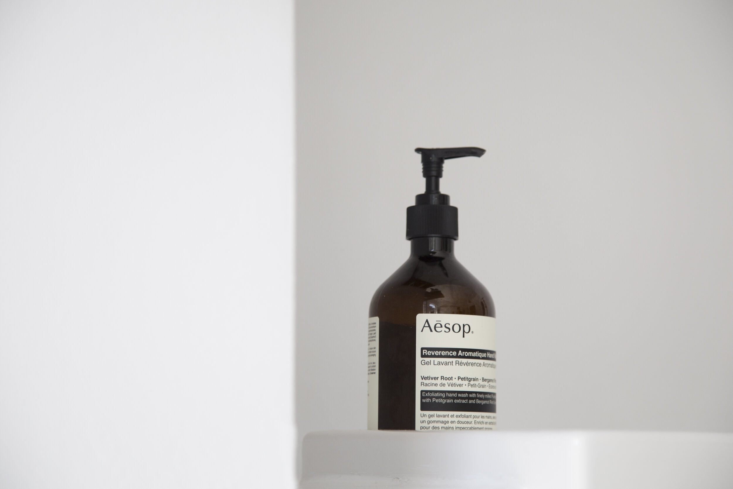
Aesop | @aesopskincare

Aesop | @aesopskincare

Barr-Co. | Image By Anthropologie | @anthropologie

Barr-Co. | Image By Anthropologie | @anthropologie

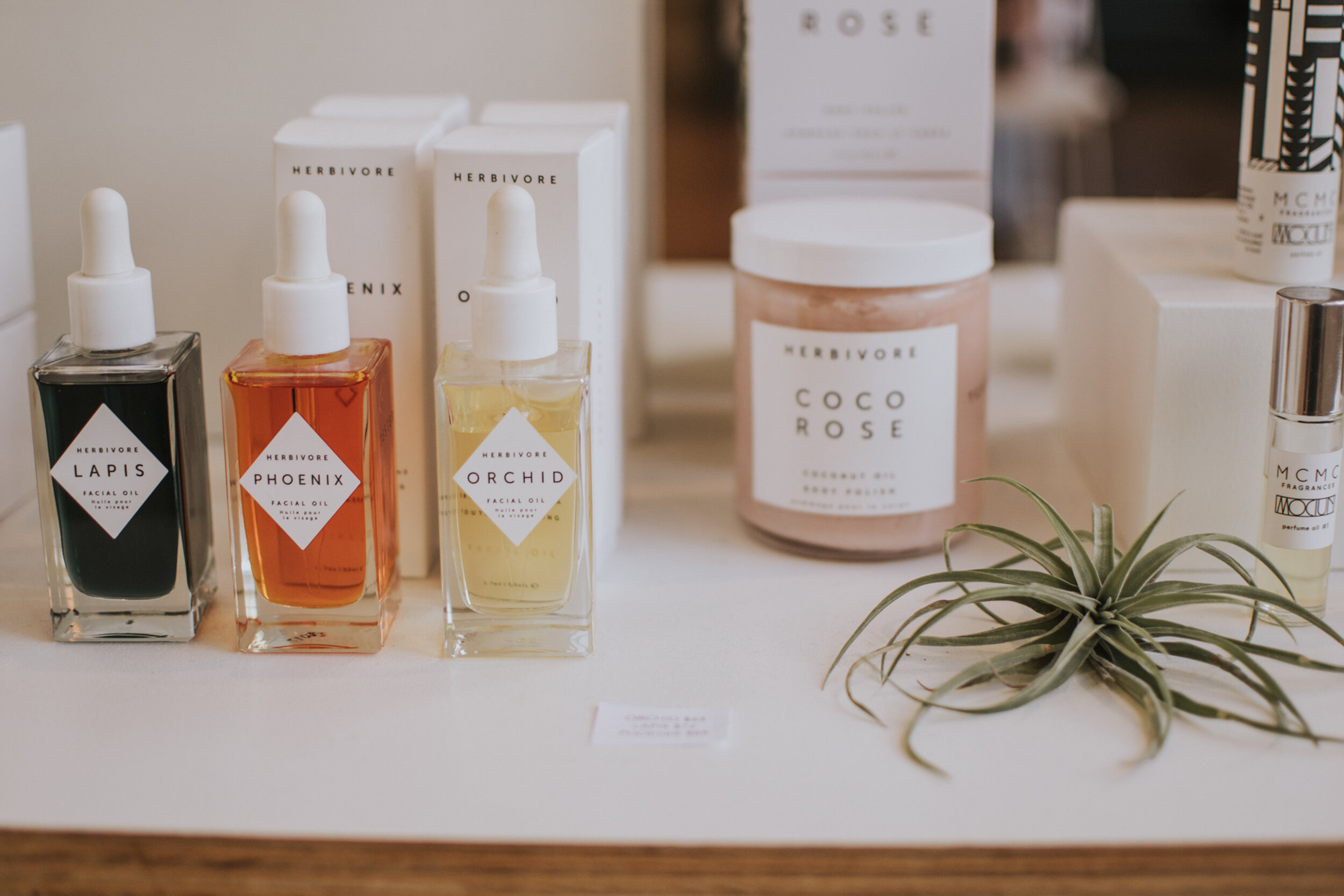
Herbivore Botanicals | Image by @herbivorebotanicals

Herbivore Botanicals | Image by @herbivorebotanicals

Moon Rivers Naturals | Image by @moonriversnaturals

Moon Rivers Naturals | Image by @moonriversnaturals

Comment

A Better Bathroom - a little about MATERIALS

Comment

A Better Bathroom - a little about MATERIALS

A quick recap on our previous blog about color: we covered giving your bathroom a personality, choosing colors that compliment your skin’s undertones, the importance of contrast (especially in a white, neutral bathroom), and ways to take advantage of small bathrooms. Let’s continue the conversation by talking about materials!

CHAPTER 2 - MATERIALS

Contrast

Jumping back into the topic of white bathrooms, let’s talk about what not to do. All white floors, walls, tiles, tub, sink, etc. are not the look and frankly never was. Don’t take this personally, we’ve all done it one time or another.

White is a great, clean look, but only when you allow it to pop with some contrast. We’re not talking about “contrasting” with other off-white neutrals. If you want a bohemian, neutral look; try using natural materials and textures to balance the space. Whatever your end goal is and the personality you have dedicated to your bathroom, pair contrasting colors, contrasting materials, contrasting patterns – white vs. a deep hue of blue, wood vs. a busy tile, chevron vs. ship-lap – whatever it may be! This goes back to giving your bathroom a personality, giving it depth and substance. Minimalism is trendy, bland is not.

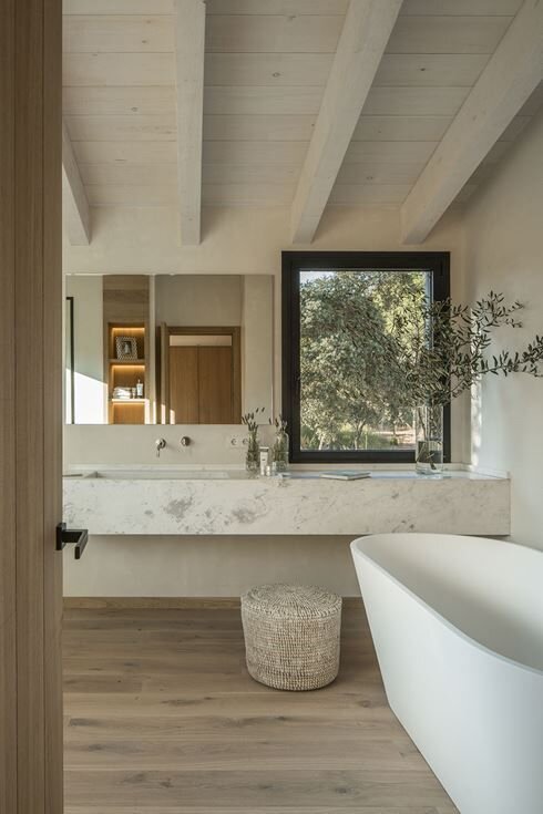
Left Image: Image By Susanna Cots Interior Design | Design: @susannacots Middle Image: Image by Sketch Forty Two | Design and photo: @sketchfortytwo | Construction: @monmouthcustombuilders Right Image: Image by Bloom Int Design | Design: @bloomintdesign | Photo: @stellarotger | Styling: @gemaberenguer | Location: @calreiet


More On That…

We’ve talked extensively about color and broadly on material contrast, but there’s a whole other world of how to incorporate visual contrast.

Designing a bathroom is not just picking out different color schemes from the same puzzle. It doesn’t have to follow any sort of set design. Let’s say you want your bathroom to be a place of Zen and tranquility - why not offset a mirror? No one is forcing you to place it directly above the sink. You’re not piecing together some standardized puzzle, you’re painting a picture, telling a story. The story here could be: you have the option to look in the mirror, but it does not have to play a part in this experience, in your mood, in the intentions you set. Instead, place a window above the sink and create a vanity space beside it. Do you want your guests to be swept away with how good they look, or how beautiful the view is? Neither is wrong, but neither is the only choice!

Another way to create contrast is to play with consistent or complementary shapes and lines. Keeping a consistent geometric or organic rhythm will “wow” your guests, without them even knowing exactly what it is about your bathroom that just makes them feel balanced.

Like in the photo above, you can do this by pairing a round mirror with round lights, cabinet knobs, a round element in the plumbing fixture, or the decorations you use. Then complimenting this shape with simple rectangle blocks seen in the wall tile, countertop, cabinetry, and a couple of floating shelves. This is just ONE example. The point of doing this is not to be obvious and flashy, but to allow your guests to feel balanced between all the layers of symmetry.

Would you have seen that in the photo without us pointing it out for you? Try it yourself! Go ahead and make a couple of notes of the shapes and lines this next photo is playing with!


If You’ve Got It, Flaunt It.

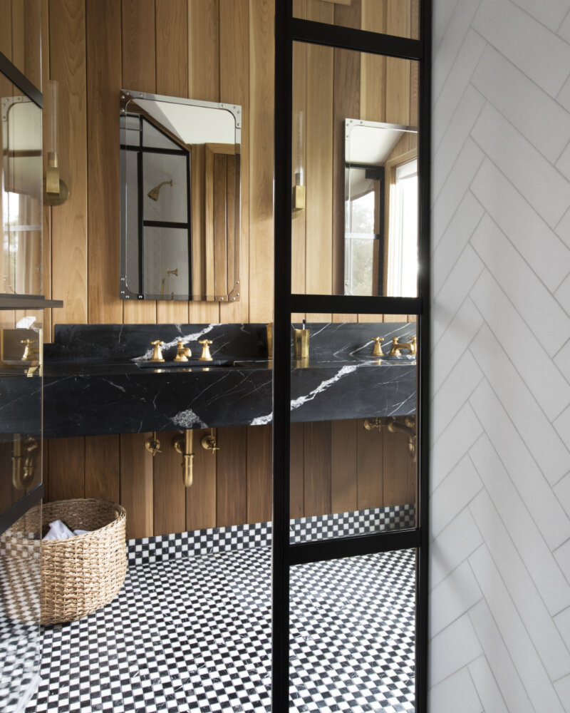
If you are at all familiar with the movie, How To Lose A Guy In Ten Days, you may be familiar with “frosting yourself”. This was the marketing slogan that Matthew McConaughey’s character used to mean: deck yourself out with jewelry. My lesson here is to let your hardware be your jewelry, or “frosting”. Don’t be afraid of those statement metals – satin gold, antique brass, brushed bronze, etc. – if anything, adore them! This is where you can make a real statement, especially if you’re designing a simple white or black bathroom, or if you’re playing with color! Carry the metal throughout the plumbing fixtures, cabinet and bath hardware, mirror frames – wherever you see fit.

Left Image: Image By Amber Interiors | Design By @amberinteriors | Photo By @tessaneustadt Right Image: Image By Amber Interiors | Design By @amberinteriors | Photo By @tessaneustadt


Where You Can & Can’t Pinch Your Pennies

(Really more of “Can, Should Not, & Depends” list, but that didn’t stick…)

Can: Tiles.

We do not condone buying the cheapest tile you can find, just because you can. If you’re willing to invest, do it. However, if you need to cut off some costs, this is a great place to consider. There are plenty of simple, sleek tile options at Lowes or your local tile store, but if you are feeling especially creative, find a small space to implement tile – whether that be above the vanity or within a shower niche – and showcase some intricate, quality options. Tile is a great way to exude the personality of your bathroom.

Can’t: Paint.

While paint shouldn’t cost an arm and a leg, it’s not worth buying the cheapest one out there because it’s “just paint”. Especially if your bathroom includes a shower, the paint you choose should be for bathrooms and should be water-resistant. Do your research – will it show streaks? Is it hard to clean? Cheap paint will make your bathroom look exactly that: cheap.

Can’t: Plumbing fixtures.

Buying quality plumbing fixtures will save you time and money in the long run. You’ve got 99 problems and plumbing doesn’t have to be one. Simple enough.

Depends: Countertops.

Let’s be clear: buying cheap countertops is not in your best interest. For one, you don’t always need a countertop. Maybe just try a floating sink! Or if you want a full vanity and don’t want to break the bank with a Marble countertop, try Quartz, Slate, Soapstone, or just visit your local countertop showroom! You don’t have to be an expert, even we don’t have to be an expert because there are already experts out there. Just don’t get suckered into a high-maintenance, high-priced Marble or Granite top if it doesn’t fit the bill. The type of bathroom you are shopping for is widely important when deciding on the type and durability of countertops.

Depends: Lighting fixtures.

If you are considering lighting for a Powder Room, this is where you can get away with a less expensive option. We are careful to use the word “cheap”, because often: cheap looks cheap. If you are selecting lighting for a full bathroom, this is where you need to invest in a good metal for those fixtures, otherwise, you will be facing corrosion due to condensation. Good lighting will elevate your space – don’t let it cheapen it. Other times, lights can be inexpensive to purchase but cost an arm and a leg to install. Read the reviews, read the installation guides and specification sheets if you need to, and absolutely keep the boxes and receipts until the lights are installed and working!


Have no fear! Pinterest is here!

We’ve touched a lot on using materials to create contrast in your bathroom design but take note: this contrast is to bring balance, not to scream at you. If you are struggling to understand or just don’t know how to implement this to your own design, Pinterest is a great resource. Pick out a couple of photos of a bathroom you admire, and note where you see contrast, personality, balance, and whatever else you want to include in your design. The point is not to copy what you see, but to observe the story being told through effective design. You got this. Check out our Pinterest board with more photos and ideas in the meantime. Until we finish this series with some tips on Function…

Stay inspired,

MSH

Comment

A Better Bathroom - a little about COLOR

1 Comment

A Better Bathroom - a little about COLOR

A mini blog series we dedicated to tips and tricks to design a better bathroom, in both attractiveness and functionality.

Whether renovating or building from the ground up, DIY-ing or working with a designer; we have some tips on designing a remarkable bathroom and avoiding some design disasters. Our goal is to expand your thinking and imagination on what could be your dream loo. We will break up the content into three main categories: colors, materials, and function. This week, let’s talk about color.

Our advice is not one-size-fits-all. These “tips and tricks” are a great place to start thinking about how you can pull away from the mundane, start thinking outside the box, and show off your beloved home.

First, ask yourself a handful of questions:

What colors do I look good in?

-        If you dislike the color on you, you won’t love it around you.

-        This doesn’t mean you should paint every wall blue because it makes your eyes pop. The advice here is to pay close attention to the undertones of the colors you choose; then, maybe, you can add some blue.

What is the space going to be used for and who will be using it?

-        Really, this is a question about whether this is a Powder Room, Master Bathroom, Guest or Kid’s Bathroom or a Jack & Jill.

What will I be doing in this space?

-        Is this where you are primarily getting ready, where you rinse off from the beach, where you wash your hands after getting home? Seriously, it matters!

How do I want to feel in this space?

-        This is most likely the place where you begin and end your day. Do you want to feel energized and confident, calm and at peace, bold, brilliant, trendy, clean? Your designs will influence this!

CHAPTER ONE - COLOR

Image by Chase Daniel via The Effortless Chic Designers: @mrslaurendaniel + @thevuvobandit | Tile: @fireclaytile

Image by Chase Daniel via The Effortless Chic

Designers: @mrslaurendaniel + @thevuvobandit | Tile: @fireclaytile

Personality + Paint

Think of your bathroom design like a baby. What do you do with a newborn? You give her a name! And the first thing you should do with your bathroom is give her a personality. Not two or three personalities, a personality. Maybe you have a specific style in mind, or all you know is that you just really want to impress your guests. Either way, like any of your favorite people, your bathroom needs to have a personality. If you’re not a fan of someone with little or no personality, you won’t love a bathroom without one either.

All this talk about personality does not give you the right to switch up your personality on us. If your home is mid-century modern, contemporary, modern farmhouse, etc; keep your bathroom that way, whether you want to tone it down or really show it off! If you have a beachy, coastal home; your bathroom should be an onward expression of it. Whatever your theme/style is, keep it harmonious in the bathroom.

Image by Lindye GallowayDesign: @lindyegalloway | Photo: @chadmellon


When it comes to paint, choosing the right color is only half the battle and not always the best place to start. Don’t be afraid to work around a tile selection or a statement piece such as a vintage vanity, a floating cast-iron sink, or whatever you have in mind. Color should add, never take away, and never be the focal piece.

I’m thinking about all of those white bathrooms that blends where the walls begin and end. Add some natural woods, natural stones, and/or interesting tile selections for contrast! Key word here: contrast. Incorporating contrast when designing your bathroom is critical. And while we love a well-designed, neutral bathroom, it can be easy for it to feel bland without the right contrast to supplement its innate simplicity.


Flatter Me!

Designing a flattering bathroom will depend on several factors, such as the size of your bathroom, the amount of natural light entering the bathroom, and the temperature of artificial light in it. Keep in mind your bathroom specifications as this next section influences your design ideas.

Image by JLV Creative via Zia TileDesign: @jlv_creative | Photo: @margaret.wright | Tile: @zia_tile

Image by JLV Creative via Zia Tile

Design: @jlv_creative | Photo: @margaret.wright | Tile: @zia_tile

When deciding on a paint color, it is best to choose a color that looks flattering on you and your guests. If you have decided to paint your walls a natural color, the tints and undertones that are inspired by skin tones are going to be your best bet. Generally, stay away from yellow and green undertones to avoid a sickly glow.

While on the topic of yellow and green undertones: we’re not saying to stay away from yellows and greens in every case! Small doses of yellow can energize and evoke feelings of confidence and happiness; while greens can induce feelings of balance, restoration, comfort, and togetherness. That doesn’t sound so bad does it? Don’t mistake this for pairing a yellow hand towel with a matching rug – you can do better than that. Dream big. Design a kids’ bathroom with Moroccan zellige with bursting yellows or glossy greens. If it flows with the personality you gave to your bathroom, we can’t tell you it’s wrong.

Not all greens are created equally. It is also important to note that there are plenty, and we mean plenty, of greens you not only can use but should. Plants are the obvious go-to, but you can also warmly welcome in those dark, cooler greens in your paint or tile selections for a more dramatic, earthy look. Tile, especially in the shower, is typically the easiest place to welcome a pop of color!

The takeaway: pay attention to the undertones of your paint color – will it compliment your skin tone or will you avoid the mirror at every visit? It is important to run with the personality of your home, and to keep in mind the primary use of your bathroom.


Image by Sarah Sherman SamuelDesign & Photo by: @sarahshermansamuel

Image by Sarah Sherman Samuel

Design & Photo by: @sarahshermansamuel

White Bathrooms – here to stay or going away?

The classic white, minimal bathrooms are here to stay, but are not the only option! White is classic, it’s clean, it looks effortless but impressive nonetheless, but don’t let it keep you from incorporating black. Whether it is a black framed glass shower door or a painted black bathroom; we are all for it. 2020 bathrooms are going to be showing a lot more black, especially more than gray.

Black is bold, it is clean and simple, and it evokes feeling of calmness and even creativity – if you do it correctly. Balance is key for any color you decide on.


small spaces

A white-painted bathroom tends to be the go-to for smaller bathrooms, usually because white can trick the eye into thinking a space looks and feels larger than it actually is. But who are you really fooling? I’m talking about those Powder Rooms or even full Bathrooms that are just big enough to fit what you need. You don’t have to be ashamed of a tiny bathroom, in fact, we recommend using your creativity and take advantage of the limited square footage! Some of our favorite small bathrooms are ones painted dark, moody colors like a deep emerald green, ones that have decorative wallpaper, or ones with bold floor or wall tiles! A tighter space has the potential for a richer personality – if you let it.


Some Final Thoughts…

If you walk away with anything, we hope it is this: whatever color you choose, choose it because it inspires the personality you have given your bathroom. Go through those first four questions at the beginning if you need help thinking through exactly what that is. What we love about design is that it is constantly evolving, inspiring, and showing up everywhere – even the loo.

Stay on the lookout for our next blog about materials to use in a better bathroom. In the meantime, check out our Pinterest board with plenty more photos for inspiration!

Stay inspired,

MSH

1 Comment

Naturally Nautical

Comment

Naturally Nautical

The unique thing about our portfolio is that there are really no two houses that are alike. We have a wide variety of styles. Learn more about one of our homes featured in Great Lakes by Design Magazine.

Click here for the full article.

Comment

UNDERSTANDING CONDENSATION

Comment

UNDERSTANDING CONDENSATION

Condensation is one of the biggest problems in a modern, well insulated home.  Additionally, it is the one which is most misunderstood.  Left untreated, condensation can lead to mold growth which can be potentially harmful and lead to serious health issues and breathing difficulties which is why it is important to reduce humidity levels in a home.

Comment